|
Random Walk in Colour Space An Experimental Art Project How it started Let me
shortly tell how I originally got the idea to this study. In 1975 I visited the
Swedish painter Olle Baertling in his atelier. He asked me if I could figure out
why the particular choice of colours, in his abstract paintings, was so
essential for the specific impact of these. In principle this could be studied
by varying the colour values and judge the aesthetic effect. But I didn’t at
that time have adequate resources for that. Much
later, in connection with a study of defective colour vision (in 1994-95), I
developed a computer program for deliberately varying the colours in any simple
grahically well-defined picture. I also used it to develop an interactive
program, with the help of which you can aquaint yourself with various colour
perception phenomena, such as simultaneous contrast, afterimages and the like.
However,
the astonishingly strong aesthetic and emotional impact that the continuously
varying colours were capable of giving a beholder made me tempted to follow this
up. So instead of alluding to
existing art works I designed a number of graphically simple and plain pictures,
to be used together with more sophisticated programs for the stochastic procedure
of colour change (described below). These
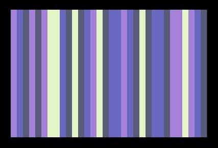
are standing bars, adjacent or as pillars on a scene against some background. Typically,
there could be 4 independently changing colours, distributed on 28 bars.
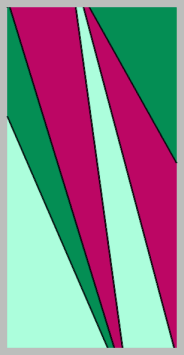
This
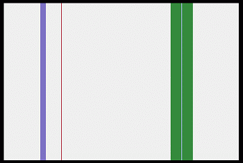
work was shown at “Moviken Art Later on I
tried a number of variants with spaced bars against some
arbitrary static background, as e.g. this:
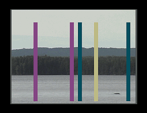
HORISONTAL
COMPOSITIONS If the
fields are arranged horisontally, the association with the idea of
a landscape view seems almost unavoidable.
Even a picture like the following one is easily interpreted as sea, shore, distant mountains
and heaven. The stochastically and
independently changing colours of the 4 areas make the impression of light
variations over the scenery, bringing with it
various moods.
Landscapes One may,
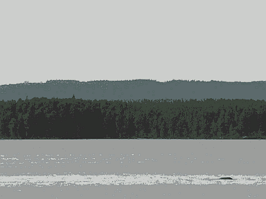
as well, start from a similar photographic image.
I have chosen to work with this still view.
(
The
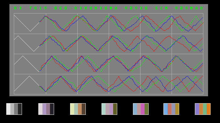
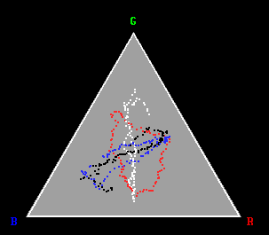
number of colours were reduced to 32 (or 16 or even less) and among these four colours were carefully
selected for random walk in the RGB colour space. I usually let them start from a
grey scale, in time resulting in a picture with casual colour combinations –
some ugly and meaningless, some astonishingly beautiful and with strong
emotional impact. The process continuously passes on, without ever repeating
itself, since the number of possible colour combinations is practically
infinitely great (1020 ).
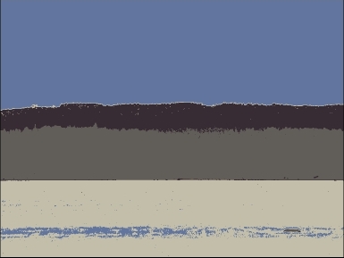
The following picture illustrates how it can look. (See also
the youtube clip,
below!)
Principles My aesthetic
intention is
that the changes shall proceed so slowly and in such small steps that you will not
notice the colour change, until you suddenly find it has happened. (Like how the
sun or moon moves on the sky.) It is a wonderful contemplative experience! Demos The following short video demos of the art-works are based on screenshots from
authentic runs of the program. (If you
look at a small screen, e.g. on a mobile phone, you essentially use the fovea
centralis, which is intellectual, good for reading text and identifying signs
and objects. You need a fuller, more extensive retinal stimulation, to
experience the emotional impact of colours.)
|