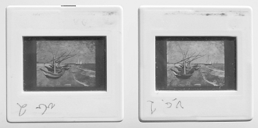
Edwin H. Land published an intriguing colour demonstration in1959. He was using two photographic black-and-white transparencies representing one and the same coloured scene. One of them was taken through a red filter, the other one through a blue-green filter.
Land observed that when he projected the two pictures onto each other, the first one through the red filter and the second one without any filter – in other words by the unmodified light flux from the lamp of the projector – the resulting image on the screen showed a diversity of colours; not only the various shades of pink one would expect from the ordinary laws of additive colour mixing.
It so happens that I in 1976 tried to reproduce Land's demonstration, to see it with my own eyes. And I have kept some slides, produced for this purpose – among others two slides representing a picture with colorful boats on a shore.

This is how the two slides look at closer scrutiny:
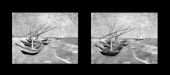
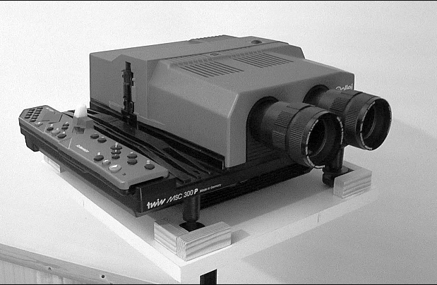
To let them come to live again I will use a Rollei Twin Projector MSC300P, which has 150 watts halogene lamps. It has a dissolve function, which means that it can slowly shift over frome one picture to the next and you may stop anywhere on the way.
I have tried to capture what one sees on the screen with help of a digital video camera. The result looks like this, to show you three examples taken somewhere on the way between the extremes red and grey.

Here is an example, taken from another of my recordings (not perfectly sharp, but that cannot be helped):
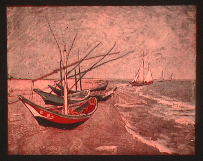
So what do we see here? Much like what we saw in the digital version of the experiment. Which shows that the digital simulation is relevant for the discussion of Land's experiment. Even here I see quite a lot of different colours: the red boat in the foreground, with its yellow mast, brown yard and a dark blue seat, box, or whatever it is, lying inside; furthermore the side of the second boat is green. The more I look into the picture, the more these colours establish themselves as undisputable.
Maybe you suspect that I see all these hues only because I am acquainted with the original picture? Well, if so, what is the difference between seeing a colour and imagine that one sees a colour? I have discussed this in the main article.
Fotnote. The reason why I prefer the digital version to the analogue one above is that here I have had to present the result by taking a digital photo of the projected image. Exposure, white point calibration and diverse other inherent routines of the camera unavoidably influence how the result looks. In the digital variant the underlying palette is more strictly limited to a straight line between the red primary and the white-point in the CIE diagram.
Let me recall a general idea from Goethe: Colour presents itself in its totality, whenever conditions make it possible. The full colour circle will always tend to appear. In the first moment we always see just colour, not colours. Colour identification, classification and specification belong to a secondary, cognitive stage in perception.
Let me illustrate what I mean with this by contemplating our red+white boat picture side by side with the full RGB-reproduction of the original.
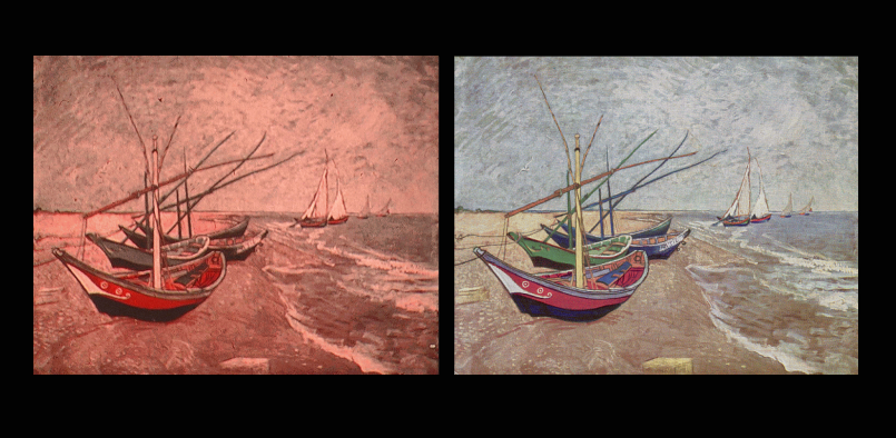
The essential difference between the two reproductions is difficult to characterise. It is such overwhelming difference in "Stimmung". There is more presence of light in the left one; and it gives an impression of warmth, due to the red-toned illumination. All hues seem to be present, not so strong and definite, alas! Except at the red boat side, which is almost glowing. In case of the digital reproduction (to the right), it can be said that the colours almost forces themselves upon us observers. They are so definite, so obstinate. And this, probably, because they are physically (colorimetrically) well-defined. This touches upon the issue whether or not a technically perfect reproduction is qualitatively preferable relative to an "old-fashioned" analogue reproduction. A topic much discussed in connection with music reproduction.
The colour filters used were Kodak Wratten Red 24 (for taking photo as well as projecting it) and Green 21 for taking the picture that is projected with neutral light. The chromaticity of the red filter together with incandescent light is nearly the same as the Red primary of the RGB-system of an ordinary computer screen.
The videos of the screen projections were taken with Panasonic HC-X920, in manual mode, with white point calibrated to the projection of the neutral picture.
It is near at hand to mix the red record with the green record, presented as cyan (= the complementary to the red primary.)
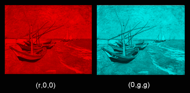
Then the span of variation is much bigger and moreover there is a mixture looking neutral.

All chromaticities are still along a line between the Red primary and the white-point in the CIE-diagram, but it extends further on towards cyan, as you can see here:
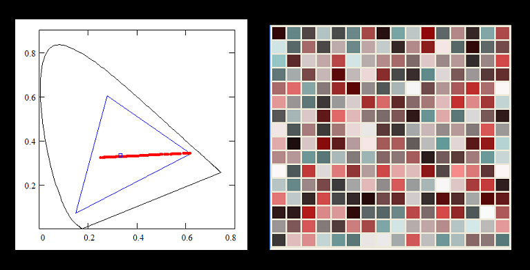
And the palette, as you see, has more hue alternatives.
The resulting image may look, with dominating red, like this:
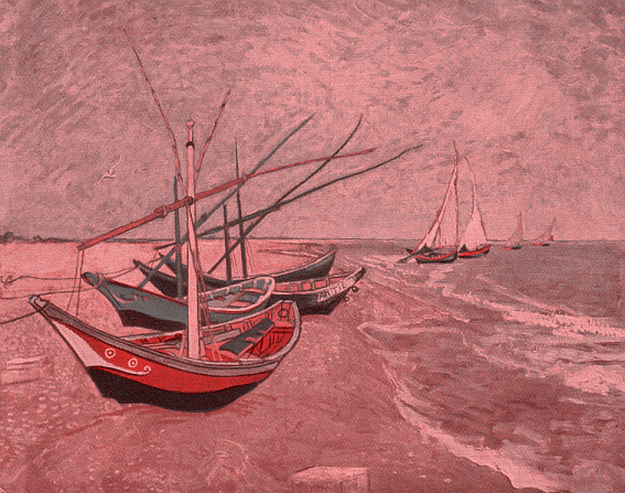
And in balance, at the white-point, it looks like this:
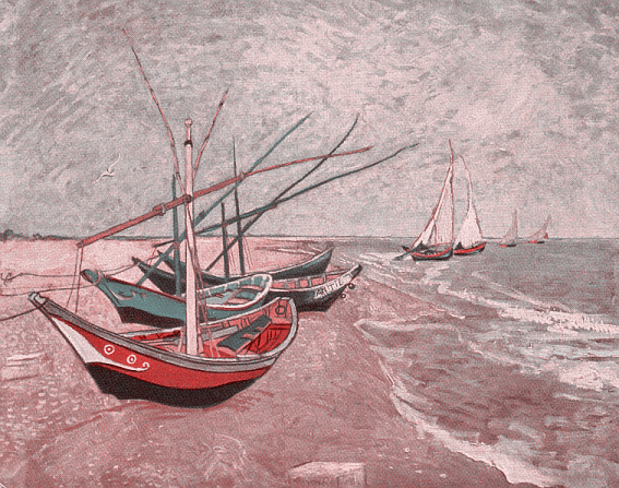
What about the distinction of blue and green here? Well, as always, I see the blue box in the boat and the green side of the second boat. Perhaps best in the reddish version -- interestingly enough!
Finally an example of a picture which seems impossible to reproduce without the blue channel. Namely a simple colour-wheel, made from Pantone samples.
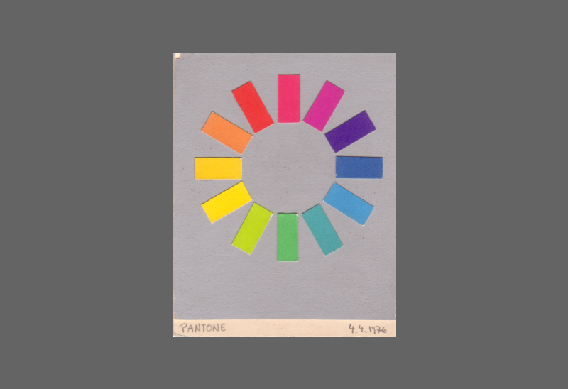
A couple of (r,00)+(g,g,g) - reproductions of it are shown here (on a brighter common background):
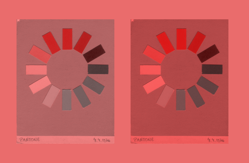
Notable is that green seems impossible to achieve. The yellow-green is shown as light grey, independently of the mixing ratio. Remarkable is that the dark violet sample is seen as such.
(C) Pehr Sällström, 2019-06-18