Pehr Sällström
THE SYSTEM OF IDEAL COLOURS
Version date 2022-11-27
Video at https://youtu.be/kWtMeuG9jS0
Some people, after seeing the fictitious exhibition "Goethe and Herbin - Paintings with ideal colours" (on video July 2020) have asked: What is so special with ideal colours? I will give you a hint about it.
We have to go back to the days of Isaak Newton and his famous experiments with glass prisms, described in the book Opticks, 1704.
Newton proposed that the elongated spectral image, he obtained by sending a narrrow beam of Sun-light through a prism, is due to a splitting up of the original beam into a series of different sorts of light, characterized by different refrangibilities, as well as different colours.
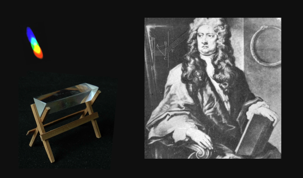
He further showed that if the process is reversed, that is, if all sorts are superimposed to form a collimated beam, the original white light is regained. This supported his thesis that the different sorts of light are, in various proportions, independently present in any flux of light.
The question now arises: How can Newton's theory be used to explain the various colours of objects we see around us?
Newton suggested: "Colours in the Object are nothing but a Disposition to reflect this or that sort of Rays more copiously than the rest;"
Which seems resonable. In other words, the spectral composition of the illumination is modulated by the material it passses through or is reflected from. And by this modulation carries with it information about the chromatic disposition of the object.
Let us tentatively study the process, using colour filters, held in the way of a flux of light. By help of a slide-projector we project on a white screen this picture:
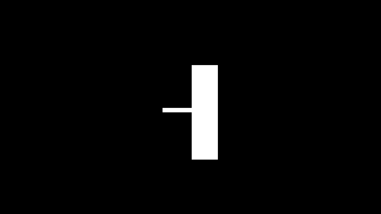
Mount a prism horizontally in front of the objective, and we get an image like this. To the left we have the spectrally separated "sorts of light", to the right we have them mixed together into white light - in this case the light from the lamp in the projector. All this is trivial geometrical optics.
Newton's difficulty in coming to grips with the issue of object colours seems to have been due to the fact that he didn't see the importance of bringing in and using the original light as reference.
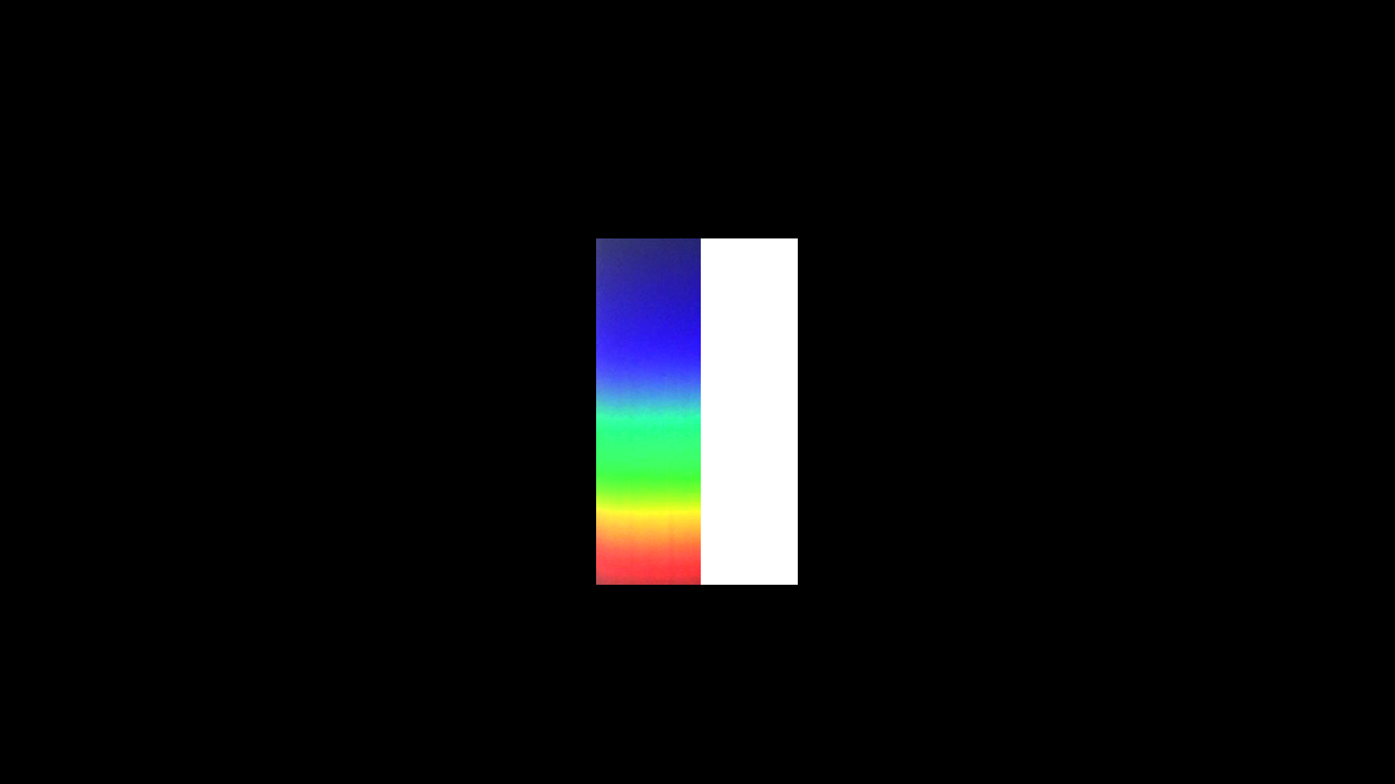
I now put a yellow filter, from the right, partly in the way of the light flux.
You see that it totally absorbs the light in the blue region of the spectrum. But seems totally transparent for the rest.
A blue filter absorbs the red and yellow at the opposite end of the spectrum.
And a magenta filter strongly absorbs the green region in the middle of the spectrum.
It is evident, at least when it comes to strong, saturated colours, as these, that a relatively broad absorption band is effective at various positions along the ordered series of elementary sorts of light.
IDEALIZING
These observations inspire the following theoretical considerations.
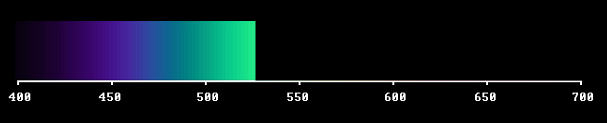
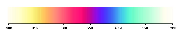
Our starting point is a full spectrum, containing all "sorts of light", here denoted as wavelengths, over the visible range 400 to 700 nanometers.
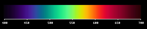
Note that when using this scale the violet end is not streched out as much as when a glass prism is used to produce the spectrum as an image. This image would be obtained if a diffraction grating is used instead of a glass prism.
Let us start by screening off a big part of it, like this.
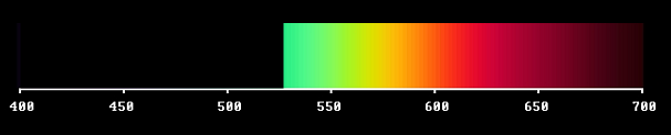
Or, to speak properly: The light sorts between 400 and 530 nm have been substituted with darkness. We always have to consider the full spectral range, which is the sensitivity range of the detector.
Of course the sensitivity of the eye receptors falls slowly at the ends. The choice of a fixed range is a boundary condition for the theory. The detector is sensitive to everything within that given range - ergo also to darkness. For a consistent theory we must regard the light sorts, that have been taken away, as potentially present.
This light flux, where we have screened off the violet and blue sorts of light, should look yellow - as we saw in the tentative study.
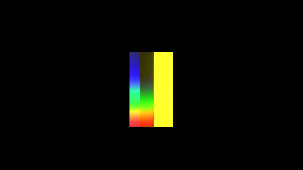
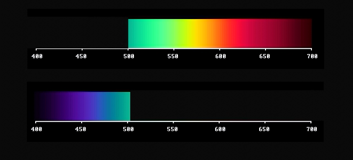
Next: What about the sorts of light we eliminated? Of course they also together constitute a light flux of a certain colour - in this case blue.
In the first spectral composition light is replaced by darkness at all wavelengths up to about 530 nm. In the second composition darkness reigns at all wavelenghts above 530 nm.
The two light fluxes are complementary, in the sense that if you superimpose them they make white. They are also opposite: one confined to the short-wave side, the other to the long-wave side of the visible wavelength window. They do not have any wavelength in common. This is the inherent yellow/blue polarity of the full spectrum.
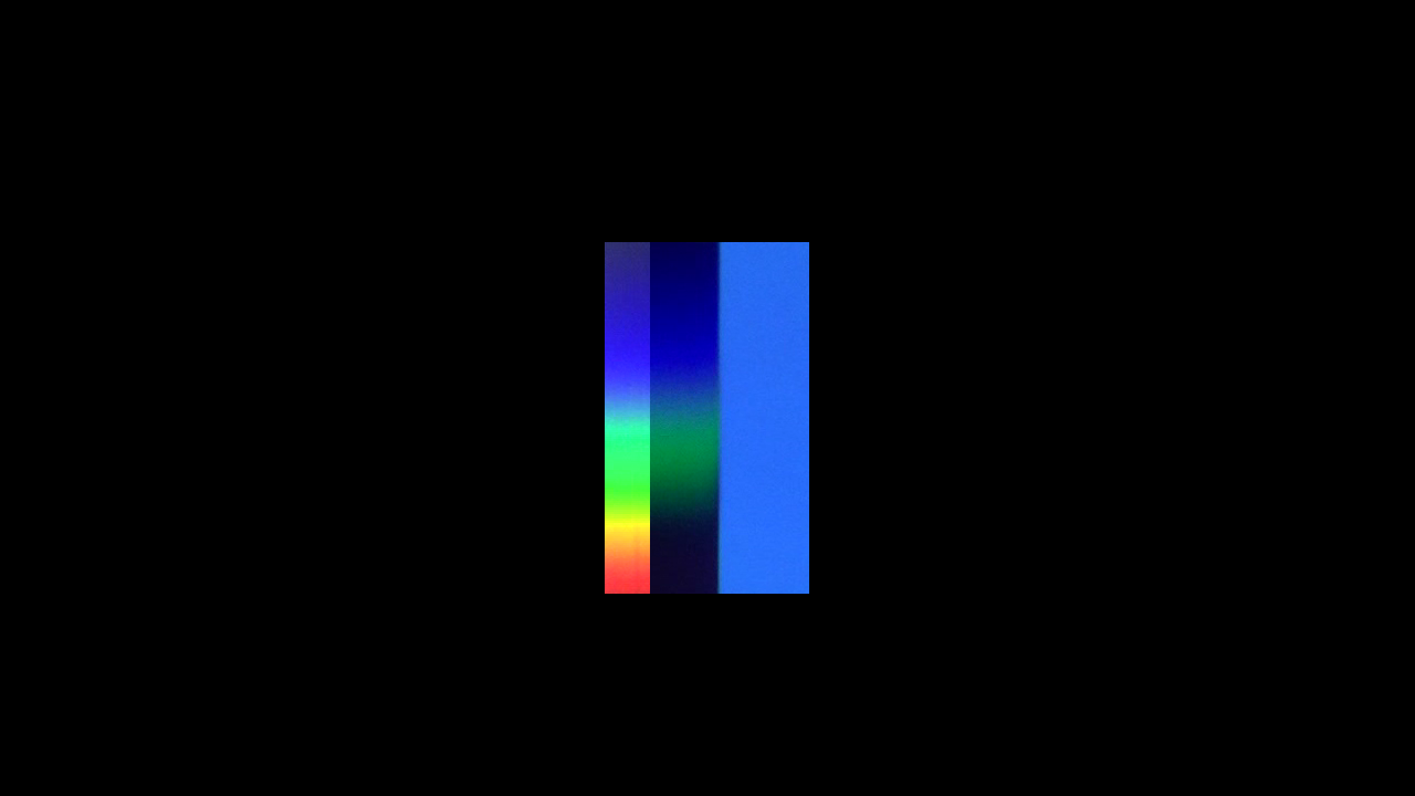
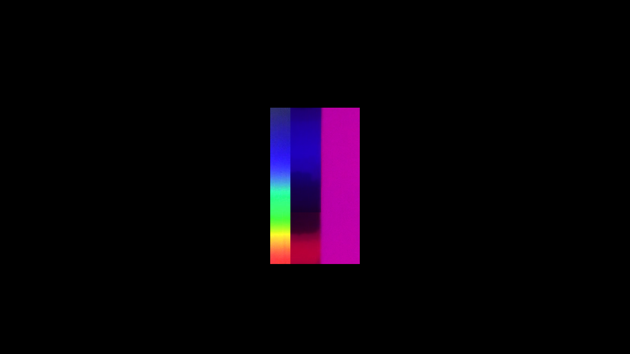
By varying the wavelength where you make the cut, you produce a whole set of complementary yellow/blue pairs of colours. Starting with a dark blue-violet together with lemon-yellow; further on to various combinations of blue and yellow, ending up with cyan together with ruby-red. They differ in what can be described as an increasing quality of redness in correlation with increasing darkness. (video)
MAKING TWO CUTS
A third step in our tentative investigation was to use a magenta filter. It absorbed light energy in a middle region of the visible spectrum.
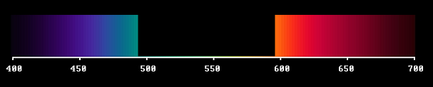
We can imagine this absorption band moving all over the visible spectral range, like this (video).
It then starts like the yellow boundary spectrum, but - as you see - it goes over into the magenta case and finally ends up with cyan, complementary to deep red.
So, an absorption band passing through the visible window generates a so called inverted spectrum: from white to white, via yellow-orange-purple-violet-blue-cyan.
However, the absorbed light, taken by itself, would represent a green light. Complementary to the purple one.

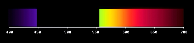
How do we generate that with absorbing materials? It seems we need two absorption bands, one at the long-wave end, the other at the short-wave end. In reality you often get this by mixing two pigments, according to the well-known rule: mix yellow and blue to get green. Anyway, to get the whole set of ideal colours, all complementary pairs must be included.
By varying the positions of the two cuts, you generate a two-dimensional set of colours, including those of the two boundary spectra as a special case. Via the purples and complementary greens you get the full circle of hues.
Furthermore, depending on the width of the gap, each hue is obtained with various degrees of saturation. Approaching zero width you get on the one hand Newton's pure wavelength light, before reaching complete darkness. On the complementary side you end up with the fullspectrum, i.e. "white light". So black and white are the poles spanning this colour system.
Light from a narrow region of the spectrum will have strongly saturated colour (as seen in a spectroscope) but relative to the full spectrum, out of which it is produced, it will be very dark. The inverted case reminds us of the Fraunhofer lines, in the solar spectrum. These do not prevent sunlight to serve as homogeneous white light, in connection with ordinary object colours.
SUMMING UP
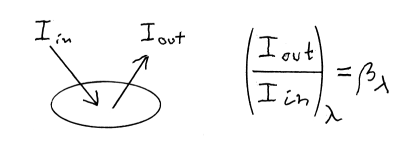
How can we mathematically characterize the filters or other material structures that accomplish the described modulations of the full spectrum?
We have to measure the intensity of the light passing through the filter, as well as the light intensity we get with a completely translucent plate (representing the incident light). The quotient gives us the transmittance coefficient. And this is calculated for a series of positions along the wavelength scale, giving -- as series of values -- the transmittance as function of wavelength.
![]()
In case of a colour sample, we measure the reflected light of the sample, compared to the light reflected from a standard white sample, giving in this case the reflectance as function of wavelength.
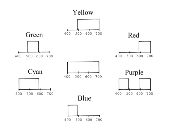
The transmittance can be represented graphically like this, for the case of a purple ideal filter:
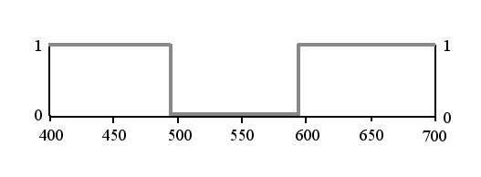
Typical for ideal colours is that they are bivalent. Either the filter is perfectly transparent, which means transmittance = 1, or it is completely opaque, which is represented by 0. The graph tells us: for each sort of light, it is either present or not in the emerging light flux. There is no compromise, nothing in between. The system of ideal colours doesn't permit of ambiguity.
So the transmittance curve describes what a glass filter or a reflecting surface does, in modulating the original illumination. Observe that it is independent of the spectral energy distribution. Transmittance is a property of the material, independent of the intensity and quality of the illumination.
Following this idea, we can draw transmittance diagrams for other ideal filters, all around the hue circle.
The following summarises the said mathematically. Let a and b be the wavelengths where we make the cut. Each pair (a,b) with b>a defines a colour Fa,b and its complementary Ka,b.
The system of ideal colours, defined by these formulas, is not only closed and unambiguos but also all-embracing. It can by used to represent the total gamut of possible object colours. This statement needs a bit further elaboration.
In my earlier video on ideal colours ("Goethe and the prismatic colours") I describe a device that is an implementation of these formulas. So you can run the cut off positions a and b and with your own eyes see the resultant F and K !
COMPARISON WITH REAL COLOUR FILTERS
To begin with, what is then the difference between the theoretical ideal colours and colour materials we find in nature? Let us compare the ideal transmittance functions with measured transmittances of ordinarily available colour filters.
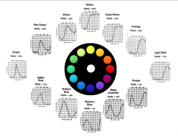
A selection of Rosco Supergel filters.
Here the transmittance functions do not simply switch between zero and one. Instead, at each wavelength, we have a certain degree of darkening. Because of this there are infinitely many possible shapes of the transmittance curves. But let us first note the similarities with ideal colours.
If you follow the wheel clockwise, starting with yellow, you can describe the change as an absorption band entering from the short-wave side and proceeding through the spectral window. At purple it occupies the middle part, at blue mostly the long-wave side. A second absorption band enters from the short-wave side, delimiting transmission to the central part of the window. Thus producing a green filter. A hue circle with ideal colours is built in the same way:
The ideal colour circle, based on the principle of complementarity, is perfectly symmetric. However, when we are dealing with pigments found in practice, the second absorption band comes close and keeps the overall transmission down, making the colours on the blue side considerably darker than on the yellow side of the hue circle.
Note that the short-wave side and the long wave side border to regions of radiation, involved in quite different processes (chemical resp thermic). The visual window (400-700 nm) arguably has a significant position within the total range of frequencies of electromagnetic radiation.
Goethe spoke of yellow as the colour closest to light and blue as the one closest to darkness. So it seems, perceptually. A blue colour sample looks perfectly blue even in dark shadow. A yellow sample needs bright light -- already in shadow it tends towards an olive-green appearance.
The inverted spectrum, ranging from yellow, via the purples to cyan, contains most of the striking colours of flower petals. A fact that was pointed out by the chemist Wilhelm Ostwald, critizing the newtonian school for its "obsession with spectrally pure lights".
SCHRÖDINGERS THEORETICAL STUDY
So what characterizes pigments that are both colourful and bright? The issue was considered by the (later on) famous physicist Erwin Schrödinger. In his younger days, at the University of Vienna, he had colleagues lecturing in colour theory and doing research into the properties of artists' pigments.
He set himself the task to find out theoretically what reflectance would give the brightest colour of given hue and saturation. He based his considerations on the Young-Helmholtz assumption of three types of retinal receptors, with different spectral sensitivities.
Which was, at that time, accepted. Furthermore, Helmholtz and his pupil König had made detailed studies (by adjacent-areas-matching with dark surround) of the lawful trichromaticity of human colour vision. Schrödinger points out, that his conclusions are valid for a greater set of possible light detectors than that of the human standard observer.
It is also interesting to note, that he combined the illuminant and the colour-matching functions to create a set of sensitivity functions. That is to say: he included light in the perceptual apparatus, by help of which object surface colours are perceived.
In 1920 he published a paper, where he shows that ideal colours are the answer to the question.
Let me remind you of the definition of ideal colours:
1) In no region of the spectrum do they have a reflectance value other than 0 or 1.
2) Their reflectance undergoes change at most at two places (transition from 0 to 1 or from 1 to 0) and cannot be zero everywhere.
A reflectance function with more than two transition places does not give rise to any new colour. This is even true for other modulations of a fullspectrum. Any colour can be shown to be chromatically equivalent with some ideal colour, under a given illumination. This means that the system of ideal colours is all-embracing.
Schrödinger further showed that the ideal colours are optimal, in that they are (or i any case belong to) the brightest among all chromatically equivalent ones.
Let me show you an example:
First you have a reflectance function following Newton's idea. Light sorts in the blue region of the spectrum are reflected more copiously than the rest, resulting in a dark blue colour.
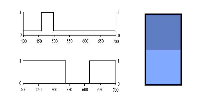
Below that, an ideal colour is shown, constructed by carefully choosing the position and width of an absorption band. The resulting colour, with the same hue and saturation, turns out to be considerably brighter.
For the calculation I used the CIE(1931) standard observer X,Y,Z functions.
Apparently inks and pigments approximating ideal colours are the most energy effective ones. And desirable for painting and colour reproduction purposes (CMY-system).
So Newton should preferably had proposed: "Colours in the object are nothing but a disposition to absorb this or that sort of Rays more copiously than the rest".
Working in a dark laboratory he never considered the fact that, under ordinary conditions, a maximal level of brightness is given and the colours are due to selective darkening. Darkness plays the decisive role, when it comes to object colours.
With ideal colours you can construct a hue circle with more saturated colours (greater chromaticity) than any colour obtainable within the RGB triangle. Following Goethe's idea: let the red ends of the boundary spectra meet, to shape an inverted spectrum (blue, violet, purples, red, orange, yellow) and mix (subtractively) the turquois and light-yellow ends to form a series of greens.
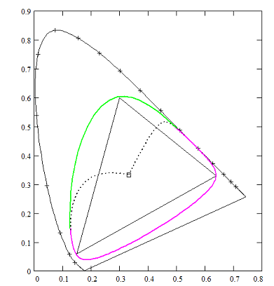
CIE-diagram showing a hue circle, built of a purple-spectrum, based on 180 nm absorption band, and green-spectrum with a resolution of 110 nm.
HOW DO IDEAL COLOURS LOOK?
Whereas the ideal colours span a two-dimensional set of possible variations, transmittance and reflectance in practice can be found in infinitely many variations. Does this mean that they lead to a more comprehensive colour world? In a sense, yes. But according to Schrödinger's analysis, any colour you find can be visually matched with one among the ideal colours, under condition that you are allowed to compensate for the fact that the real colour may be considerably darker than the corresponding ideal colour.
Thus, any colour you observe in the world around has a visual equivalent among the ideal colours, but usually with an excess of darkness - or blackness, if you like - when seen among diverse other colours under one and the same illumination. This gives rise to colour qualities described as "earth colours", "brown", "olive" and grey (sic!). It is an astonishing, but logical, fact that there is no place for any grey scale in the world of ideal colours.
Schrödinger points out that whereas ideal colours have certain general properties and mutual relationships - common for all material object colours - exactly how the colours in a particular situation look is dependent on the illumination; its intensity and spectral energy distribution. Each light has its own colour world, with its own flavour.
However, even in the case of quite drastic local change of the spectral composition of reflected light from a surface, we tend to regard it as "something with the illumination". The perceptual constancy of object colours is a remarkable experience.
FINAL WORDS
What is so exciting with ideal colours is that they exclusively have to do with the periodicity property of radiation, i.e. what wavelengths (or frequencies) are to be found or not in a beam of light.
The intensity and the periodicity of the radiation we experience as light are essentially independent dimensions.
Modulation of the intensity is what we experience as a play of light and shadow in practical situations. Informing us, among other things, about the positions and shapes of objects.
The wavelength composition informs us about the inner nature of matter, since it is related to atomic and molecular structure. Moreover, it is a translation invariant property of the light state, which means that the spectral composition even may supply information about chemical elements in the constitution of distant astronomical objects. / Thank you.
POSTSCRIPT
What do I mean with these concluding words? Well, I find the separability of luminance and chromaticity worth commenting on. You remember the anecdote with Galilei and the waving candelabra in the dome. He noted that the period of the swinging pendulum was independent of the amplitude. This turned out to be a basic property of any harmonic oscillator. Of fundamental imporance for the phenomenon of resonance. Making possible acoustic communication, as well as that of wireless electromagnetic dito.
The shape of the spectral power distribution of a light signal is essentially a statistical effect. But the spectral composition - described in binary terms (i.e. for any wavelength telling whether it is present or missing) - turns out to be a sign, specific for the light emitted from or absorbed by pure molecules or atoms in gaseous state.
Of course, ideal colours are just a first approximation of such a general ideal composition of a light flux (studied in spectroscopy). And the fact that we are concerned with absorption bands is again a statistical effect, related to the fact that we have to do with absorption from dense packs of molecules, when dealing with pigments or colorants under ordinary conditions.
If luminance variations is the first degree of modulation, then the chromatic variation is second degree, and spectroscopic measurements take care of higher degrees of modulation. /PSm
*
Another question that may arise in the listener to this lecture is "How can we see the reflectance of surfaces as their colour?" - This concerns the issue of Sensation versus Perception.
Newton, following Galilei, thought that the experienced colour quality was a "sensation", in some way caused by the light flux impinging on the retina, and being specifically different for the different elementary sorts of light (=pure wavelengths).
But what we perceive as the colour of an object doesn't need to be based on an immediate impression - like taking a photo - but is rather the result of an ongoing process. Thereby integrating a lot of information, leading to a consistent view of the surrounding world. Within which the object surface gets its colour-quality. More or less related to its physical reflectance, depending on circumstances. /PSm
REFERENCIES
1) Isaak Newton, Opticks (1704) Dover ed 1952 (my page ref).
My quotation is from (Book One, Part II), Prop II Theor II, Definition (page 125) "... so Colours in the Object are nothing but a Disposition to reflect this or that sort of Rays more copiously than the rest; ..."
See also Prop X (page 179) where he restates the quoted approach:
"These Colours arise from hence, that some natural Bodies reflect some sorts of Rays, others other sorts more copiously than the rest."
2) In the book Farbkunde (Leipzig 1923) Wilhelm Ostwald has an extensive critical discussion aginst the Newtonian doctrines, as represented by Hermann von Helmholtz.
Note that Ostwald's systematization of reflectance is different from that of ideal colours. He describes it as a sum s+v+w (blackness+fullcolour+whiteness) based on the fact that reflectancies in practice never vary between 0 and 1 but rather have a certain over-all reflectance (=whiteness) and less than 100% reflectance (=blackness).
3) I have a copy of Erwin Schrödinger's article in English translation, and with an introduction by Michael H. Brill. I don't remember where I found it, but you can, for instance, read the Schrödinger paper on https://www.yumpu.com/en/document/view/10516331/
Some general information around Schrödinger's interest in colour theory can be found in Walter Moore's biography: "Schrödinger. Life and Thought" (1989, paperback ed 1992) page 120-129.
Moore points out that "In the early 1920s Schrödinger became recognized as the world authority on color theory." (...) "Color theory stands at the crux of the ancient mind-body problem. By working in this field Erwin could be both a philosopher and a scientist."
4) Who actually came up with the term ideal colours I don't know. Moore says it was Schrödinger. Anyhow, it is used by P. J. Bouma, in his quite extensive discussion of boundary colours, in his useful book: "Physical aspects of colour" (original 1945)