
Dr. Pehr Sällström
Lecture at the conference "Goethes Farbenlehre im Lichte neuerer Untersuchungen aus Physik, Wissenschaftsgeschichte und Philosophie", held at Philosophicum, Basel
29-30 September 2017
ON THE COMPATIBILITY OF GOETHE’S COLOUR THEORY
WITH THAT OF NEWTON
Version per 2018-05-14
Ingress
Meeting the Phenomenon of Prismatic Colour Spectra
Once upon a time – back in the nineteensixties – I came across a book by the Norwegian author André Bjerke: “Neue Beiträge zu Goethes Farbenlehre”. I did the prismatic experiments described therein, and saw with excitement this variety of colour spectra and their systematic relationships, which was all completely new for me.

You have the two boundary-spectra, appearing at the boundary between a black and a white area: The yellow/red one and the cyan/violet one. Next, the boundary spectra can be made to merge into secondary spectra, taking us to the usual Newtonian spectrum, as well as its complementary inverse. Furthermore, the spectra can be turned into each other by interchanging black and white in the picture observed through the prism. A perfect symmetry! Light and dark play equivalent roles in the world of colour, it seems.
I spontaneously thought that I had to find out how this beautiful miniature colour system might be analysed and described in terms of physics. That turned out to be not altogether easy. I knew of course that colour has to do with the wavelength of light, but how to apply this knowledge to the phenomenon I now had before my eyes, was not immediately given.
I wanted to find out if Goethe had a point with his critical attitude against
the Newtonian treatment of colour. And why his own contribution was not regarded
as relevant. Was there something essential Newton and his followers had
overlooked? And are the two approaches after all compatible?
Part One
Spectral Distributions as the relevant Correlate of
Colour
In order to find out the appropriate physical description of the Prismatic Colour Spectra and their System, I preferred considering what Goethe called “Die objektiven Versuche”.
If you place a prism on a white cardboard and let the Sun shine onto the set-up, it looks like this.
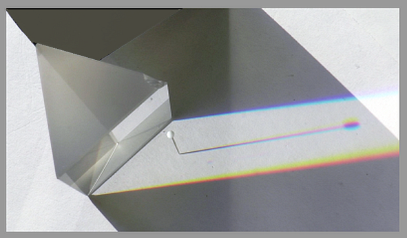
Immediately behind the prism there is a region of colourless light, which is
however “dispersed”. Which means: light of various wavelenghts have
systematically slightly different directions. This is not seen until you place a
shadow-casting object in the flux of light. The tiny shadow behind the needle turns into
a spectrum with yellow, purple and cyan.
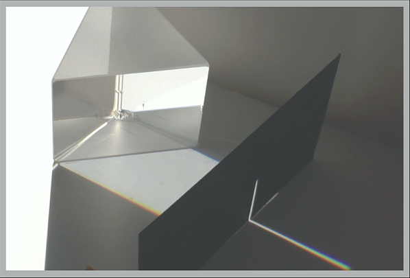
Alternatively, if you place a screen with a narrow opening in the flux of colourless light, a Newton-spectrum is obtained.
Now I wanted to analyse the spectral compositions of the light at different positions in all these various kinds of spectra. Starting with the boundary spectra. Instead of doing it by theoretical analysis, I found a way to do it experimentally, in a setup like this.
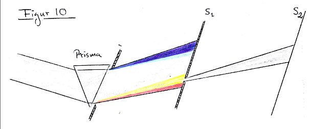
By sliding screen S1 to various positions, you get on S2 a spectral analysis of the
light at that position. Let us see how it looks!
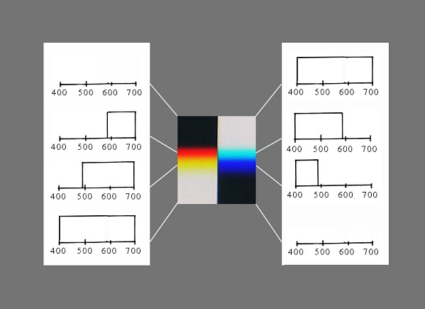
Here comes the yellow boundary spectrum. You see how the full spectrum of light at first looses its violet end, then the green middle, until you are left with red and finally end up in darkness.

Doing the same with the blue boundary spectrum, we cut away components from the
long-wave-side. First the red, then green and we are left with the short-wave
violet.

Summing up with diagrams, it looks as follows. To the left you have the analysis
of the yellow boundary spectrum. To the right, the blue one. Observe the
symmetri: You seemingly cut up the full spectrum in two parts.
The secondary spectra, with green and purple, can be analysed in the same way,
but I didn’t manage to do it with my relatively simple equipment. However they
are the result of combining the procedures: Either cutting away from both sides,
leaving the green middle. Which procedure in the limit ends up with a spectrum
of pure wavelengths.
Alternatively, analysing the inverted spectrum (let me call it the
Goethe-spectrum) you see a dark region running through the spectrum. This dark
region is thinner the farther away from the shadow-casting object you choose the
point where you make your measurement. In the limit you end up with a full
spectrum – in other words just white. (Upper diagram)
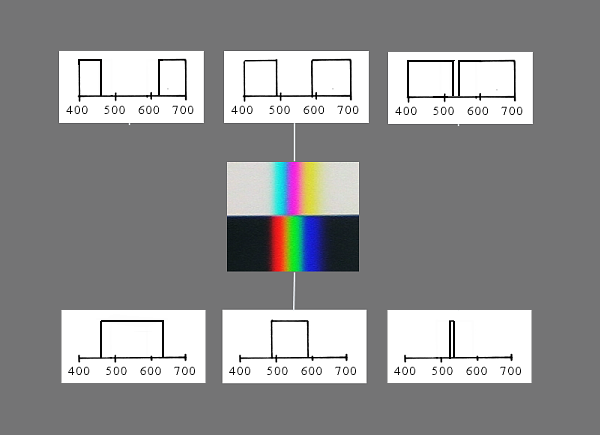
Evidently, when we speak of Newton- and Goethe-spektra, this refers to two classes
of possible spectra. The boundary spectra, on the other hand, are uniquely
defined.
Summing up. I have turned Goethes colourful experimental demonstration into a set of diagrams. But the structural relationships among these are the same as we saw among the colour spectra. By varying the conditions you generate the full colour circle and all the complementary pairs. All in all a structural totality.

Observe that this illustration represents the logic of the geometry of the set up. It is completely treated within ray-optics. Each diagram answers yes or no to the question concerning which wavelenghts are to be found in the illumination at the spot where the spectral composition was measured.
That I used a Newton-spectrum to determine these spectral compositions, was only because the different positions in this spectrum represent the series of wavelengths. I make no reference to the colours of the Newton-spectrum.
This might seem as a subtle distinction – but it is essential. Newton had the idea that the spectral colours into which a ray of sun-light is split up, should be the determinants of the colour of any light flux in general, by dominating its spectral distribution.

We see immediately from the diagrams above that this is not necessarily true. For instance, the spectral distribution of yellow should be dominated by wavelengths around 580nm, which is not the case. Instead it is the removal of the short wavelengths from the full-spectrum, that produces the yellow colour.
Likewise cyan depends on the absence of long wavelenghts and purple on the absence of middle wavelenghts. These relatively bright colours are the typical colours of the Goethe-spectrum. The darker colours: red, green and blue-violet, we recognize from the Newton-spectrum.
Evidently some colours are produced by the absorption of a small part of the spectrum and leaving the rest. Hence they are relatively bright. Another group of colours are produced by absorption of a major part of the spectrum. This is more like what Newton had in mind.
*
Of course these prismatic spectra – often called “ideal spectra” – are very artificial and one may ask whether they are representative of the spectral distributions of ordinary colours, met with in practical life. It turns out that, yes, they are.
For instance an ordinary yellow surface may have a reflectance curve like this.

I can assure you that if we subtract from this distribution all light around the
wavelength 580nm – where there is a tiny strip of yellow in Newton’s
spectrum – the remaining light would still look the same yellow.
As a matter of fact, it was not until 1923 that the chemist Wilhelm Ostwald, in his book “Farbkunde”, criticised the newtonian school for its obsession with spectrally pure light. He pointed out that the boundary spectra and the inverted spectrum are closer to the reflectance spectra occurring in real life. A fact that among other things is important from a biological point of view, considering the evolution of the eye.
The following figure shows an example of transmission spectra of colour transparencies,
grouped around the colour circle. (Roscolux filters).

Observe that yellow is placed at the top, due to it being the brightest colour. (This is an often used alternative to Goethe’s arrangement with purple at the top.)
This colour circle is of course not as perfectly symmetric as in the system of prismatic colours. This is how things looks in nature! Two relatively broad absorption bands move through the visible interval, generating the repeated colour series.
Spectral distributions versus individual wavelengths
Maybe this is the place to go a bit further into the question why individual wavelengths per se cannot be the appropriate determinants of the colour of light. And that we have to consider the Spectral Power Distribution, which is a concept on a higher level of abstraction.
The rays and their associated wavelengths belong to the theoretical framework of geometrical optics. They need not even correspond to physical entities. The reason why individual wavelengths cannot be the determinants of colour, is apparent from the following example.
Say that you focus a pencil of light of wavelength 540 nm onto a region of the retina. It gives rise to the sensation of a green spot.

Now add to the pencil some rays of wavelength 430nm (the blue-violet part of the spectrum). What happens? The colour of the spot changes to a cyan-blue, the corresponding wavelength of which is not present! But the rays with wavelength 540 nm are still there, unchanged. This wavelenght does not change. Only the colour of the light changes. What conclusion can be drawn from this?

You may feel tempted to say: We evidently see the result of mixing the colours of the two wavelenghts. But what is meant by that? Light fluxes of two wavelengths do not combine to make light of a new wavelength. They do not interact in any way. The so called “colour mixing” must take place, not in light, but in the eye or the mind of the beholder. And what should be meant by “mixing” colours? Goethe was notoriously sceptical against a notion of this kind. Colours are what they are, they can change, they come and go. If we perfectly superimpose two illuminations we get a homogeneous illumination with a certain colour. If, instead, we let the two component illuminations fall onto a screen side by side, we see two fields, in general with different colours. What so? We are regarding two different optical situations.
So as long as we keep to a description of the physical side of the visual process, we must say: The reason why the 540 nm light gave rise to a green colour is the fact that there were no other wavelenghts present in the beam of light. As soon as there are other wavelengths present, the light beam gives rise to another colour sensation.
Ergo: it is the spectral distribution as a whole over the visual interval, that determines the colour. Not the presence of any particular wavelength. Absence of light – “darkness” if you like – contributes to determine the colour as well as does the presence of light. Darkness has its consequences. This is a fact that Newton seems to have overlooked.
The importance of taking spectral distribution as physical correlate of colour is also that you can then define a physically based concept of complementarity of colours, as we saw above, in the diagrams.
The colour valency of spectral distributions
I have so far vaguely been speaking of the shape of the distribution as determining the corresponding colour. It is a kind of aesthetic evaluation. But is it physics?
I have based this interpretation on the original colour observations with the prism, under Goethe's excellent guidance. These observations are pure matters of fact. The question has been how far a physical description can do justice to these indisputable empirical facts.
My idea is that what counts, as concerns light as stimulus to the visual system, has to do with whether the spectral distribution as a whole is articulated towards the long-wave side or the short-wave side, respectively towards the center or the edges. As suggested in the following diagram.

The indicated properties of the distribution function are what the eye is capable of detecting. Higher terms in a series expansion of it are invisible. The eye does not perform a detailed spectral analysis. But it applies a measure to the distributions, which effectively projects them onto a tri-dimensional space of so called "colour valencies".
Note: Observe that what is so far not explained is the typical double structure of the boundary spectra. A far as my theory goes they could as well be uniformly varying, more like the setting sun, for instance. In contrast to this the boundary spectra, and even the combined spectra, have a nonuniform structural variation as far as hue is concerned. And this may tell us something, of course, that remains to be clarified. It has to do, however, with the fact that we use an artifical device, the glass prism, to produce the phenomenon. The spectral distributions become idealized, but not ideal, from the point of view of colour theory. The spectra of the setting sun and the blue sky are more to the point. When we use cut-off-spectra, of the prismatic kind, the fysiology of colour vision is partly revealed. The structure of the spectra can be “explained” with reference to the fact that we have three types of cones in the retina, with slightly different absorption spectra.
INTERLUDE: HERING’S ANALYSIS OF THE SPECTRUM
Newton never carefully observed the spectrum, it seems. He only regarded it as a series of hues with transitional regions. The angle of refraction is a linear variable, to be sure, but the colour quality along the spectrum changes more intricately than that. Let me show you Ewald Hering's analysis, in terms of so called opponent colour functions. [4] Here is the spectrum (shown versus wavelenght, which makes the violet part compressed, and the red end enlarged, relative to how it looks in the prismatic case.) Hering suggested you should describe it in terms of the opponent pairs yellow/blue and red/green, referring to the “yellowish/blueish” and “reddish/greenish” appearance of the colour.

Starting at the violet end, we have at first a blue-red hue, with diminishing redness until a pure blue is reached, then green takes over, resulting in blue-green (cyan) for a while but soon we reach the point where blueness changes over to yellowness, at which point we have pure green (a green that is neither blueish green nor yellowish green). Further on we have a region of yellow-greens of increasing yellowness until we reach the point where red takes over from green, which is the point of pure yellow. And from that on the colour is yellow-red with increasing redness. So the pure wavelenghts are not “pure” as regards colour. Most wavelengths are “mixtures” of colours.
The curves describing the mixtures can be measured “psycho-physically” by a colour matching procedure. [5] You can so to speak “measure” the Spectral Power Distribution in terms of y/b and r/g and furthermore w/bk. These three values are the trichromatic measure of the distribution. Distributions that have the same “colour valency” are equivalent for the receptors of the eye.
Newton, of course, could not avoid being aware of the fact that there must be some rules of additive colour mixing, describing what colour results when two coloured beams of light are superimposed. This was his dilemma: how could all the partial lights of a full spectrum of sunlight in superposition constitute a colourless beam of light? He says in Opticks (in connection with Prop. VII, Theor V):
The Rays in that mixture do not lose or alter their several colorific qualities, but by mixing their Actions in the Sensorium beget a Sensation differing from what either would do apart .. [6]
and moreover:
For whiteness is a mean between all Colours, behaving itself indifferently to them all, so as with equal facility to be tinged with any of them. [7]
Which statement, by the way, points in the direction of my experimental analysis above, of colour as modifications of the initial uncoloured light of the full-spectrum.
Newton, in Opticks, describes how the laws of colour mixing could be investigated [8], but did not himself have the means for exploring the laws quantitatively, and left it to the future. (He could have used a rapidly rotating colour-wheel. But he evidently did not get the idea of using it to define the proportions in an additive colour mixture.) In fact it was not until one hundred and fifty years later that his suggestions were taken up and elaborated into the so called trichromatic system of colorimetry. Most prominently by James Clerk Maxwell, in a pioneering article published in 1860. [9] He used a method of visually matching various combinations of spectrally pure lights. A certain linear combination of the “standard matching functions” has been shown to be similar to the chromatic valency functions of the Hering opponent colours system, presented above. And can be used for determining the visual equivalence of various spectral distributions.
The trichromaticity of the receptor stage of the visual process explains the stylised form of the spectra. So we arrive at the following formal definition of colour, from the physical point of view:
Colours are equivalence classes of spectral power distributions
Part Two
Holtsmark’s critical study of Newton’s Opticks
Already at an early stage I got to know Torger Holtsmark, a physicist at the University of Oslo. He had once been part of the group of people that André Bjerke gathered with the aim of experimentally clarifying the conflicting aspects of Newton’s and Goethe’s approaches to colour. Since then Holtsmark had become deeply engaged in Goethe’s ideas about science of nature in general, and the Farbenlehre in particular.

In 1970 Torger showed me an article he had published in American Journal of Physics, dealing with the basic experiments in Newton’s Opticks and pointing out some confusing statements made therein, which he meant were responsible for the limitations of the traditional view on the physics of colour. In the article he presents a thought experiment to clarify his analysis. [10]
I found it tempting to try to realize this thought experiment as a concrete demonstration and finally managed to do so. The result has been documented in the film “Monochromatische Schattenstrahlen”, which will be shown this evening at the colour exhibition.
Let me give you a short glimps of the main idea behind the experiment.
To experience the close relationship between the Newtonian and the Goethean spectra, Holtsmark makes use of a simple but wonderful optical device, namely a plane mirror, with a thin slit on it, where it is transparent.

By help of this “mirror-aperture” you simultaneously produce a light ray and a dark ray. And if you place it in a field of dispersed light, you get a Newton- and a Goethe-spectrum, as schematically shown here.

It is immediately evident that the two spectra are complementary, in the sense that added together they recreate the original colourless flux of dispersed light.
Now comes the sophisticated part of the experiment. We add two apertures, one above and one below the initial one.

By help of the lower aperture we can select, say, a central part of the
Newton-spectrum, creating a green ray of light in the darkness on the other
side. The upper aperture simultaneously selects from the Goethe-spectrum a
corresponding central part, and lets it pass on to the upper side. It does,
however split up into a Newton-spectrum with a dark region where green normally
should be found.
However, let the upper aperture be a mirror-aperture, with the reflecting side
upwards in the figure. Then the purple of the Goethe-spectrum passes on as a
purple ray in white surround.

Here is a picture from the video, showing the upper mirror selecting the purple ray from the Goethe-spectrum, produced by the central slit-mirror.

Astonishingly enough, the produced purple-ray is deflected without being decomposed, if a prism is placed in its way. The original inner structure of the light flux is kept intact by reflection on a plane mirror. So, this purple ray can be called a monochromatic dark-ray. It is a ray with the same wavelength as the corresponding monochromatic green ray.

What we have shown is however that one and the same ray (characterized by its degree of refrangibility) may appear as green or as purple (or even white and black, under other conditions). There is no "proper" colour belonging to rays of specific wavelengths. To call them “monochromatic” is a misleading praxis.
Newton seems to have been aware of his mistake of identifying colour with wavelength. In a supplementary definition he states: [11]

This "Power and Disposition" of light is what he had actually discovered and which I have spoken about as the "wavelength" of light. But as we have seen, light of a specific wavelength does not by itself stir up the sensation of a specific colour, since it is rather certain properties of the spectral distribution as a whole that is detected at the retinal receptors.
Part Three
Bedingungen versus Ursachen
It is evident from the statement above that Newton had a causal explanation of colour vision in mind. He was concerned with the underlying local processes of vision, not its content. Goethe however says: (Das reine Phänomen. 15 Januar 1798 [12])

So he looked around in nature and pointed out the structural similarity, for
instance between the boundary spectra and the blue of the sky together with the
reddening of the setting sun. As being, in a sense, two sides of the same
phenomenon:

If you ask a physicist: Why is the sky blue? The usual answer would be: Because sunlight is weakly scattered in the atmosphere, shorter wavelengths somewhat more than longer wavelengths. So the scattered light, that reaches us, is blue.
OK – and what more? Didn’t you forget something? --- Namely the dark universe behind. It is a necessary condition for the blue colour. A correct explanation must contain this condition. Often, the absence of light might be a condition of equal importance as the presence of light!
Colour is a sensitive expression of the actual situation as it is. On the macroscopic scale where we human beings are at home. Not of any “fundamental properties" or processes underlying or being the substratum of the phenomenal world. Hence Goethe’s method was rather to look for structural similarities among various phenomena.
This makes me think of what the philosopher Ernst Cassierer says in his excellent little book “Zur Logik der Kulturwissenschaften”. [13]

Conclusion
Goethe and Newton in comparison
Why did Newton not interest himself for the systematic properties of colour spectra? I think there are many answers to this. One is to find in the very different approaches of Goethe and Newton.
Newton experimented in a dark chamber with a thin beam of light – a kind of imitation or implementation of the abstract rays of geometrical optics. He managed to show how to produce a beam of light that behaved in accordance with the law of refraction. [14] This kind of light he called simple and came to regard as an elementary constituent of light in general. In order to explain the phenomenon of dispersion (what happens to a beam of light when it passes the boundary between say air and glass) he had to assume the existence of various sorts of light - which has come to be addressed as its "wavelength". This turns out to be a fundamental property of radiation. With his experimentation he showed us what one can do with light and how – the consequences of this knowledge for science and technology have been overwhelming.
Goethe, on the other hand, made his study in a room ordinarily lit with daylight and having white walls. He praises his luck, that he did not have any dark chamber where he could try out Newton’s experiments. Because then he would perhaps have fallen into the same trap as Newton. And had missed complementarity as a fundamental relation in the colour world. And the role of darkness as a condition for the appearance of colour. It was natural for him to regard the white, uncoloured light of the sun -- or daylight in general -- as the most elementary state of light, out of which the states connected with variously coloured lights where shaped. There is, from that point of view, nothing particularly "elementary" about the pure wavelength states. They are limiting cases of possible spectral distributions.
Actually, Newton never defined “white”. He was concerned with the wavelength-nature of light, and this is completely independent of intensity. In his “experimentum crucis” he didn’t need to consider the issue of illuminance.
He never considered an "ordinary" situation as starting point for a colour theory. In any such situation there is a given level of illumination. Only when you have both an upper bound and a lower bound on possible luminances you have a closed system. Each colour is positioned between white and black as the poles of the colour gamut of the, in the given situation established, colour world. Each chromatic colour being darker than white but brighter than black. Some hues being dark, others bright, by their very nature. And it is only then you can define complementarity between spectral distributions.
My conclusion is that, after Newton’s statements have been properly
corrected, his theory is compatible with Goethe’s views. And can serve to let
us go deeper into aspects that demand quantitative treatment. Such as the
phenomenon of metamerism
and the details of how the spectral distributions of various substances are
related to properties at the molecular level. As far as the physical
aspects of colour vision are concerned, we do not have to choose between G
and N. Finally: REFERENCES
1. André Bjerke: Neue Beiträge zu Goethes Farbenlehre, Verlag freies Gestesleben, Stuttgart 1963 (Swedish ed 1961)
An important conclusion is however that colour and wavelength should not be
identified. Colour is sensibly varying according to conditions. It is not something material,
that needs to be hidden away somewhere or be brought forth from somewhere. It
comes and goes, as Goethe says. Wavelength, on the contrary, is something
fundamental, stable, unmutable, permanent, invariant along the ray, independent
of intensity, independent of the presence of other wavelengths.

Farbenlehre, in Goethe's sense, comprises by necessity much more than the physical
side I have been elucidating in this lecture. Studies within perception psychology have intricate
phenomena to contribute, as have the history of art and aesthetics, to be sure.
Farbenlehre is essentially an interdisciplinary realm of research.
2. Sir Isaac Newton: Opticks 1704, Dover edition 1952, p 179
3. Wilhelm Ostwald, Farbkunde, Leipzig 1923
4. Ewald Hering: Zur Lehre vom Lichtsinne (1878) Mitteilung Sechs §38 Farbsinne.
5. L.Hurvich and D.Jameson: Some Quantitative Aspects of an Opponent-Colors Theory, Journal of the Optical Society of America 1955-56
6. Newton (as above) Opticks p 159
7. dito p. 159
8. dito, p 160
9. James Clark Maxwell: On the Theory of Compound Coours, and the Relations of the Colours of the Spectrum. Proc. Roy. Soc. London, 10, 1860.
10. Torger Holtsmark: Newton's Experimentum Crucis Reconsidered. American Journal of Physics Vol 38, No10, 1229-135, 1970
11. Newton, Opticks p 124
12. J.W.Goethe, Leopoldiner Ausgabe, Band 3, Erste Abteilung, Weimar 1951, p 308
13. Ernst Cassierer, Zur Logik der Kulturwissenschaften 1942, ed. Wissenschaftliche Buchgesellschaft, Darmstadt 1961, p.87
14. Newton – se his Axiom 5, Opticks p 5
© Pehr Sällström. October 2017 - May 2018
LIST OF TEXTS